
Part 3 of 3 - Strategies and scenarios.
Important note: This article is for general information purposes only and does not constitute investment, legal, or tax advice. All figures, returns, and sample calculations mentioned are based on historical data and simplified scenarios — past performance is not a reliable indicator of future results. Trading in precious metals, stocks, and other asset classes described here carries risks, up to and including total loss of the capital invested. CelticGold AG assumes no liability for decisions made on the basis of this article. Please seek independent advice from a licensed financial, legal, or tax advisor before making any investment decision.
A quick recap of Parts 1 and 2
Before we dive in, here's the foundation from the first two parts — compact:
- The actual return is everything. A 15% annual return is essentially the industry standard — what hedge fund managers and our ultra-wealthy clients reach for themselves. And frankly: if you don't get the 15%, someone else does. The money doesn't disappear, it just moves to whoever is better structured than you.
- Eliminate risk first, then talk about returns. A 50% loss needs a +100% gain just to get back to zero. That's why the cash reserve comes first — 3 to 6 months of expenses, available at all times, without price risk. Only once you're standing on solid ground does a discussion about returns make any sense at all.
- "Buy and hold" alone isn't enough. Even gold and the S&P 500 each delivered only 9–11% per year on their own over 25 years — solid, but below the benchmark. Getting closer to 15% requires more than an investment that simply sits there.
That's exactly where Part 3 picks up: how does a private investor actually get close to that 15%? Let's get started. (The detailed derivation can be found in Part 1: The Basics and Part 2: Foundational Protection and Risk.)
Gold and silver are the entry point into "direct ownership without a middleman"
Diversification — but done right
"Diversification" is one of the most-used and least-understood words in the financial industry. The common idea: just buy several different stocks and you're diversified. Unfortunately, that's too simplistic.
Diversification means spreading your capital across investments that behave differently in different situations — not simply across many positions. We already discussed in Part 2 the crucial difference between correlated and uncorrelated investments: Coca-Cola and PepsiCo mostly move in lockstep — anyone holding both believes they're diversified, but hardly is. Gold and the S&P 500, on the other hand, often move in different directions — and that's exactly what reduces overall portfolio risk.
Real diversification means combining asset classes that react differently to different economic conditions. And this is where a tool comes into play that very few private investors even know about — let alone use.
Cycles: the key almost nobody uses
Every asset class moves in cycles — from overvalued to undervalued and back again. Stocks, real estate, commodities, precious metals: all go through phases where they are expensive relative to other assets, and phases where they are cheap. This isn't theory — it can be tracked in black and white in any good charting tool.
The trick: instead of looking at the price of a single asset, you look at the ratio between two assets — a so-called ratio chart. Classic combinations:
- Real estate / gold — how many ounces of gold does an average house cost?
- S&P 500 / gold — how many ounces of gold does the entire US stock market cost?
- S&P 500 / real estate — are stocks expensive or cheap relative to houses?
- Gold / silver — the classic precious metals ratio.
And all of these combinations can additionally be run against oil — gold/oil, stocks/oil, real estate/oil. As the foundation of virtually every value chain (transport, production, agriculture), oil serves as yet another, independent yardstick.
The appeal: currency drops out entirely
The really nice thing about this method: you're comparing real asset to real asset. Stocks with precious metal, real estate with precious metal, oil with precious metal. The euro or dollar in which both sides are normally traded cancels out completely. Whether the dollar has lost 5% or 50% of its purchasing power in the meantime makes no difference to the ratio between the two real assets — you see the pure valuation of two investments relative to each other, cleaned of monetary policy and inflation.
This is why experienced investors work with ratio charts instead of just staring at the dollar price of a single asset: the dollar price shows you how an investment has performed in a constantly depreciating currency. The ratio chart shows you how two real values have actually shifted relative to each other.
And the longer the time window you choose, the clearer the patterns become. Let's look at four examples over the last 50 years.
Example 1: S&P 500 / gold — 50-year cycle
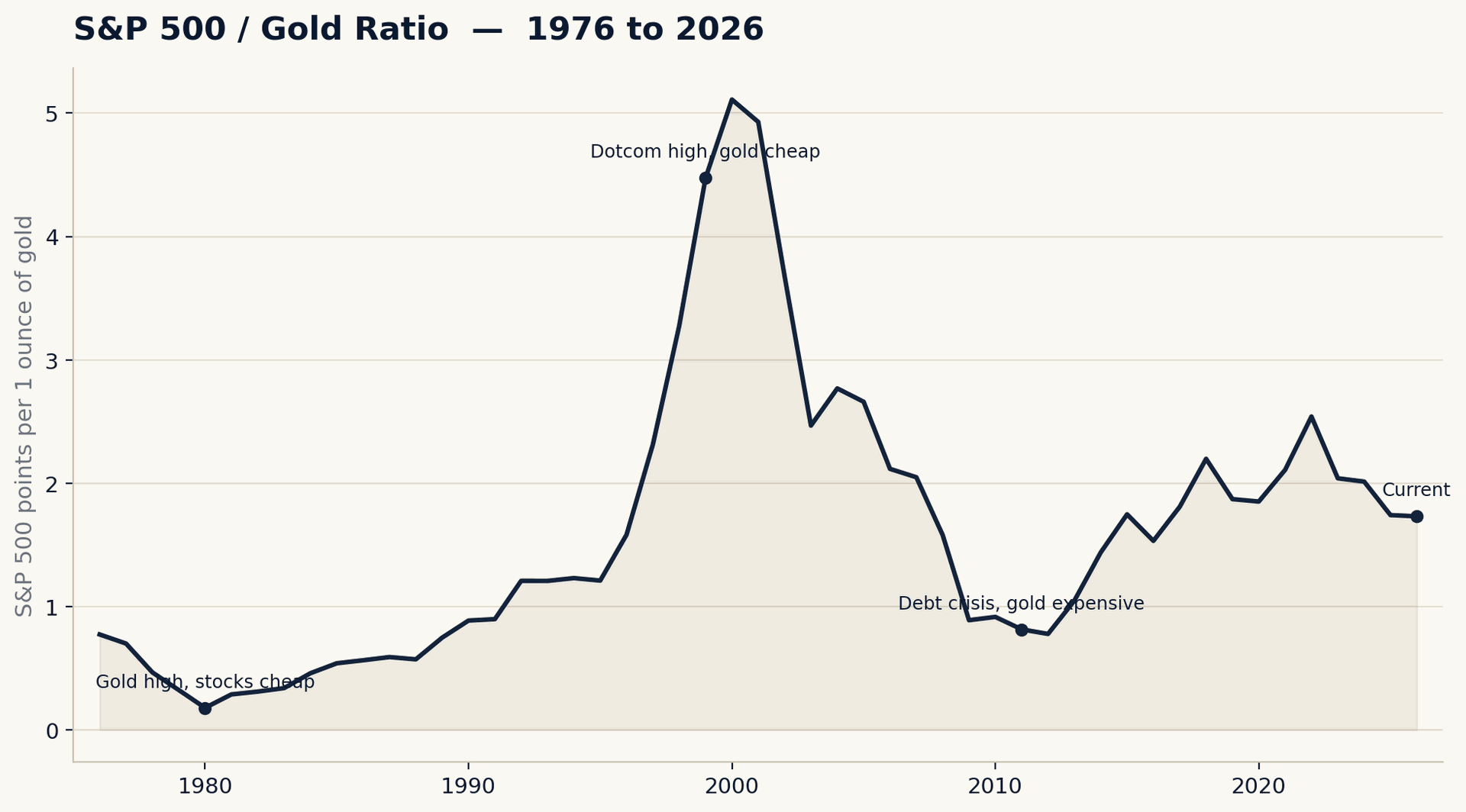
This ratio shows how many ounces of gold the S&P 500 "costs." Looking at the last 50 years reveals three very clear extremes:
- 1980: the ratio falls to around 0.18 — gold is extremely expensive relative to stocks (inflation, oil crisis, Iran crisis), stocks are dirt cheap.
- 1999/2000: the ratio shoots above 5 — the dotcom bubble makes stocks more expensive relative to gold than ever before. Gold trades at around 279 US dollars, and practically nobody wants it.
- 2011: after the financial crisis and amid the European debt crisis, the ratio falls below 1 — gold is in high demand again, stocks are cheap by comparison.
- Today (2026): the ratio is around 1.7 — noticeably above the 2011 low, but well below the dotcom euphoria.
Discussion
Anyone who recognized in 1999 that stocks had historically never been so expensive relative to gold would have spotted one of the best reallocation moments of the past 50 years: out of stocks, into gold — and in 2011, when the ratio flipped to the other extreme, back into stocks. This exact movement — not buying and holding forever, but shifting between undervalued real assets whenever an extreme is reached — is at the core of any strategy that wants to go beyond the 9–11% of "buy and hold."
Example 2: gold / silver — 50-year cycle
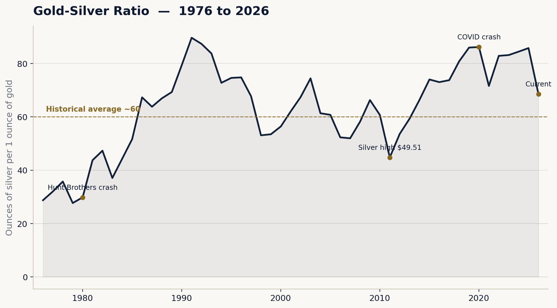
This ratio shows how many ounces of silver you get for one ounce of gold. The historical average since the end of the gold standard is around 60. Here too there are very clear extremes:
- 1980: ratio around 30 — the Hunt brothers cornered the silver market, making silver extremely expensive relative to gold.
- April 2011: silver rises to almost 49.51 US dollars (intraday), the ratio briefly drops to around 32–35 — silver is as "expensive" relative to gold as it has rarely been in modern times. (On a yearly-average basis the curve shows "only" around 45 due to smoothing — the actual peak was a single-day phenomenon in April 2011.)
- March 2020: the COVID crash causes silver to collapse while gold, as a crisis currency, stays more stable — the ratio spikes intraday above 120, at times as high as 125. Silver is as "cheap" relative to gold as it has almost ever been.
- January 2026: both metals hit their all-time highs simultaneously in the same historic rally — gold at around 5,590 US dollars, silver at 121.62 US dollars. The ratio falls to around 46: silver is again unusually "expensive" relative to gold, though not quite as extreme as in 2011.
- Today (2026): ratio around 69 — after both metals have pulled back from their January highs, closer again to the long-term average.
Discussion
The principle is identical to the S&P 500/gold ratio, just playing out between two precious metals instead of between stocks and precious metal: whenever the ratio reaches a historical extreme, it's worth considering a swap — not buying or selling for currency, but metal for metal. That brings us to the concrete worked example.
Example 3: real estate / gold — 50-year cycle
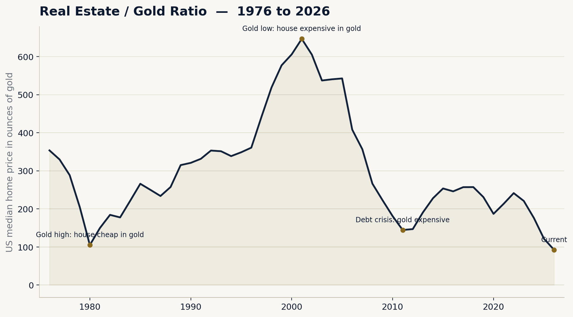
This ratio shows how many ounces of gold an average US house "costs" (based on the US median new-home price, Census Bureau/FRED). Here too a very clear pattern emerges over 50 years:
- 1980: ratio around 105 ounces — the Hunt-brothers-era gold boom makes gold extremely expensive relative to real estate; the house can be paid for with comparatively little gold.
- 2001: ratio shoots to around 646 ounces — after two decades of a gold bear market and rising house prices, gold is as cheap relative to real estate as ever. Anyone who reallocated from real estate (capital) into gold at that point would have caught a historic low.
- 2011: ratio falls to around 145 — the debt crisis and the gold boom shift the ratio clearly back in gold's favor.
- Today (2026): ratio around 92 — gold is as expensive relative to real estate as it last was around 1980.
Discussion
Here too: at the 2001 extreme (ratio ~646), it was worth looking at gold; at the extreme around 1980/today (ratio ~90–105), it's worth looking at real estate instead. The principle remains exactly the same as with the precious metal ratios — only here one real asset (house) is set against another (gold), again completely without a currency component.
Example 4: real estate / S&P 500 — 50-year cycle
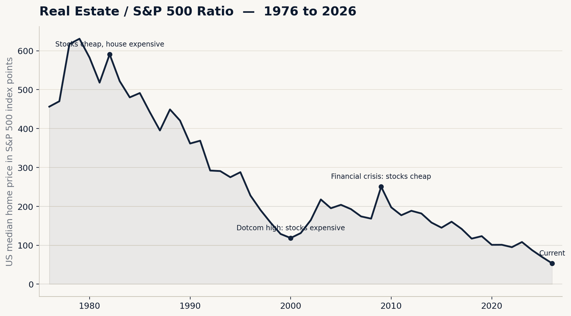
This ratio shows how many S&P 500 index points an average US house "costs." Here too a clear up and down:
- 1982: ratio around 591 — after the recession, stocks are dirt cheap, real estate is very expensive relative to the stock market.
- 2000: ratio falls to around 119 — the dotcom bubble makes stocks more expensive relative to real estate than ever, making the house look "cheap" by comparison.
- 2009: a brief spike to around 250 — the financial crisis causes stocks to collapse while real estate prices (nominally) stay more stable.
- Today (2026): ratio around 53 — the lowest level in the entire observation period. The US stock market is as expensive relative to real estate as it has ever been in the last 50 years.
Discussion
This ratio is particularly notable right now: nowhere in the last 50 years has the S&P 500 been as expensive relative to a house as it is today. That doesn't automatically mean "stock crash ahead" — but it is exactly the kind of signal a ratio chart is meant to deliver: a historical extreme that deserves a closer look before allocating your capital one-sidedly in either direction.
Diversification beyond a single real asset:
The worked example: silver → gold → silver → gold
Let's take a real-world scenario: 1,000 ounces of silver are swapped into gold in 2011 at a ratio of 1:35, swapped back into silver in 2020 at a ratio of 1:120, and finally swapped back into gold once more in January 2026 — when both metals hit their all-time highs at the same time.
(A quick fact-check up front: a ratio of 35 at this scale was indeed observed in April 2011 — silver briefly ran to almost 49.51 US dollars while gold was trading around 1,500 US dollars. The 2011 annual average was somewhat higher at around 45, since the peak only lasted a few weeks. The ratio of 120 matches the COVID crash in March 2020 exactly. For the calculation below, we use the LBMA annual average price for 2011 as an approximation for the starting value — the mechanics of the calculation are unaffected by this.)
Step 1 — Starting point: 1,000 ounces of silver
At the LBMA annual average price of 35.12 US dollars per ounce (2011), 1,000 ounces of silver are worth:
1,000 × 35.12 US dollars = 35,120 US dollars — at an average EUR/USD rate of around 1.39 in 2011, that's about 25,266 euros.
Step 2 — Swap into gold at a 1:35 ratio
The swap happens metal for metal, with no detour through currency:
1,000 ounces of silver ÷ 35 = 28.57 ounces of gold
Step 3 — Swap back into silver at a 1:120 ratio
Years later (2020), the ratio has shifted in silver's favor. The swap back:
28.57 ounces of gold × 120 = 3,428.57 ounces of silver
From the original 1,000 ounces, two pure metal swaps — without ever touching a single euro or dollar in between — turned it into 3,428.57 ounces of silver. That's the actual trick: the amount of silver has more than tripled, without betting on a rising silver price in euros or dollars — purely through the shift in the ratio between the two metals.
Step 4 — Swap back into gold in January 2026
Five years later, the chart delivers the next extreme — this time in the other direction. On January 29, 2026, gold and silver both hit their respective all-time highs in the same historic rally: gold at around 5,590 US dollars, silver at 121.62 US dollars. That gives a ratio of around 1:46 — significantly higher than at the 2011 entry point, but still well below the long-term average of 60, because silver was pulled up especially strongly during this rally.
3,428.57 ounces of silver ÷ 46 = 74.59 ounces of gold
From the original 1,000 ounces of silver, three pure metal swaps later, you now have 74.59 ounces of gold — without a single euro or dollar changing hands in between.
Step 5 — Value today, as of August 2026
Current gold price: 4,488.90 US dollars per ounce. Current EUR/USD rate: around 1.1685.
74.59 × 4,488.90 US dollars = 334,847 US dollars → around 286,561 euros
Notably: gold itself has pulled back around 20% from its all-time high in January 2026 ($5,590) to today. But silver, over the same period, has fallen from its all-time high ($121.62) to $65.51 — a drop of almost 46%. Whoever swapped from silver into gold in January 2026 didn't catch the perfect exit, but did hold the significantly more stable of the two assets while both pulled back from their highs.
The tally
| Value | |
|---|---|
| Starting value 2011 | approx. €25,266 |
| Final value August 2026 (after 3 swaps, in gold) | approx. €286,561 |
| Period | 15 years |
| Overall multiple | 11.34× |
| Total return | +1,034.2% |
| Annualized return (CAGR) | ≈ 17.6% p.a. |
For comparison, what alternatives would have delivered over the same period:
| Strategy | Final value Aug. 2026 | CAGR |
|---|---|---|
| Ratio swap silver → gold → silver → gold (3 swaps, ratio 1:35 / 1:120 / 1:46) | approx. €286,561 | ≈ 17.6% p.a. |
| Ratio swap silver → gold → silver (2 swaps, ending in silver) | approx. €192,217 | ≈ 14.5% p.a. |
| Buy & hold silver (1,000 oz simply left alone) | approx. €56,063 | ≈ 5.5% p.a. |
| Buy & hold gold (bought in 2011 at the real price, held) | approx. €85,825 | ≈ 8.5% p.a. |
| Ratio swap using real intraday extremes 2011/2020 (ratio 30.49 / 127, without the 3rd swap) | approx. €233,492 | ≈ 13.6% p.a. |
The third swap makes the decisive difference: while the two-swap version (ending in silver) stays at 14.5% p.a., just under the 15% benchmark from Part 1, the three-swap version clearly breaks through the mark at around 17.6% p.a. Simply holding — whether silver or gold — remains at around 5.5–8.5% per year, clearly behind. That's the core of the ratio strategy: not buying one asset and holding onto it, but consistently switching into whichever side is undervalued each time an extreme is reached — into gold in 2011, back into silver in 2020, back into gold again in early 2026.
And what if you had actually hit the exact intraday extremes? If you calculate not with annual average prices but with the real daily prices — April 25, 2011 (silver's intraday high of 49.82 US dollars, gold at the same time at 1,519.20 US dollars, a real ratio of 30.49) and March 18, 2020 (a ratio of 127:1 according to the Silver Institute, the historic all-time high) — the first two swaps surprisingly produce a lower annualized return: around 13.6% p.a. through 2020, with an interim value of about €233,492. The reason is purely mechanical: whoever swaps exactly at the intraday high also pays the full intraday peak price for their silver — the starting base is already "expensive" as a result (€34,454 instead of €25,266 at the annual average). The more favorable ratio does yield more gold and, ultimately, more ounces of silver, but the higher starting base eats up part of that advantage when you look at the annualized return. The real takeaway: the leverage in this strategy doesn't come from hitting the exact dollar high or low, but from catching the ratio itself at an extreme — and that can be achieved with reasonable approximation even without perfect day-by-day timing. (The premium of around 8% over the raw commodity price typically charged in Germany on sales is deliberately not factored into any of these calculations.)
What this means for you as a private investor
A few important takeaways from this example before you start working with ratio charts yourself:
- This is not about timing the perfect day. Nobody swaps exactly at the daily low or high. The calculation above deliberately uses realistic, but not perfect, entry and exit points — around 17–18% p.a. is achievable without hitting the exact bottom or the exact top.
- Extreme ratios are rare — and that's exactly why they're valuable. A ratio of 35 or 120 doesn't occur every year. Anyone relying on this strategy needs patience and an eye on the chart — not constant activity. Compared to day trading, this is relatively relaxed; in our example, that's three moves over 15 years.
- The fundamentals from Parts 1 and 2 remain mandatory. Cash reserve first, no consumer debt, no leverage, no speculating with money you'll need in the next few years. Only after that does a strategy like this make any sense at all.
Taxes: country-dependent — and not a detail to skip
A metal-for-metal swap with a precious metals dealer is generally not a tax-neutral event, but is treated like a sale followed by a new purchase. What this means for you specifically depends entirely on which country you are liable to pay tax in — and the rules differ considerably in some cases:
- In some countries, private investors benefit from a tax exemption on the capital gain from physical gold and silver after a certain holding period.
- In other countries, every swap or sale is treated as a taxable event regardless of holding period.
- Allowances, deadlines, tax rates, and the treatment of silver versus gold can differ significantly from country to country within the EU — and these rules also change over time within a single country.
These differences can't be responsibly covered country by country in a blog article, and as CelticGold we are precious metals dealers, not tax advisors. Before actually implementing a ratio swap or a similar strategy, speak with a tax advisor familiar with capital investments and precious metals in your country of residence — regardless of how small or large the transaction is. This isn't a formality — it can determine the actual net return of your strategy.
Frequently asked questions about ratio charts and diversification
What does the gold-silver ratio mean? The gold-silver ratio indicates how many ounces of silver you get for one ounce of gold. At a ratio of 60, one ounce of gold is worth as much as 60 ounces of silver. If the ratio rises or falls sharply, the relative value of the two metals shifts against each other — regardless of whether the dollar or euro price of both metals is currently rising or falling.
What is a ratio chart and what is it used for? A ratio chart shows the relationship between two assets (e.g., the S&P 500 to gold, or gold to silver) rather than the price of a single asset in a currency. Because the currency component cancels out, a ratio chart reveals valuation cycles that remain hidden in the pure dollar or euro price history of an asset.
What does diversification really mean? Diversification does not mean holding as many different positions as possible, but spreading capital across investments that behave differently in different economic situations — in other words, that are uncorrelated. Holding two stocks from the same industry is not real diversification, even if it's formally two positions.
Is the gold-silver ratio swap tax-free? There's no blanket answer. Whether and how a metal swap is treated for tax purposes depends on your country of residence, the holding period, and the allowances and deadlines that apply there. Before implementing it, this belongs in a conversation with a specialized tax advisor.
Summary and conclusion
- Diversification means uncorrelated, not just "many positions." Investments that behave differently in different economic situations reduce risk — not the sheer number of positions in a portfolio.
- Every asset moves in cycles between overvalued and undervalued. Ratio charts between two real assets — stocks/gold, real estate/gold, gold/silver, all also combinable with oil — make these cycles visible because the currency component cancels out completely.
- The real opportunity lies at the extremes. 1999/2000 and 2011 in the S&P 500/gold ratio, 2011 and 2020 in the gold/silver ratio — these are the turning points where a targeted switch between two real assets pays off.
- The worked example shows the scale involved: starting from 1,000 ounces of silver, three ratio swaps over 15 years (2011–2026, silver → gold → silver → gold) turned into around 286,500 euros — an annualized return of around 17.6%, above the 15% benchmark from Part 1 and far ahead of simply holding silver (5.5%) or gold (8.5%).
That closes the circle of this series: in Part 1 we understood the mechanics of interest and compound interest and defined the 15% benchmark. In Part 2 we built the foundation — cash reserve, no debt, eliminate risk first. In Part 3 we saw how the gap between the 9–11% of buy-and-hold and the 15% benchmark can actually be closed: through diversification across uncorrelated real assets and by deliberately exploiting their valuation cycles relative to each other.
The one financial plan that makes all other financial plans obsolete turns out, in the end, to be no secret and no product that anyone needs to sell you. It's mechanics, foundation, and patience — and the willingness to take your finances into your own hands, instead of waiting for the next promise from the depths of the internet.
This article is part of a three-part series and does not constitute investment, legal, or tax advice. All sample calculations are simplified, historically documented scenarios and are not a promise of future returns.